Monday, October 25, 2010

PTI blog hop - holiday

This month's theme was to create a card for a winter holiday that is not Christmas, in order to celebrate diversity.  I chose to do a card for Chinese New Year for a dear friend.


I used a red panel, as the colour red is thought to ward off bad luck.  The paper has flecks of gold and silver and looks very festive.  I embossed an image from BB: Retro with gold powder as this sort of reminded me of lanterns, and the colour gold also plays prominently in the festivities, and symbolizes posterity. 

Looking at it now it looks like the layout needs something in the right side - will have to address that.


I die cut shapes for the sentiment in cream and fine linen, stamped a flourish in versamark, sponged some distress ink on the outer cream die cut to soften, and popped the whole thing up on dimensionals.  I'm excited to send this one out!

Enjoy the rest of the hop!

Supplies - Stamps; Background Basics: Retro, Giga Guidelines, Fancy Flourishes (PTI), Paper; Fine Linen and cream (PTI), Japanese PP (Paper Ya, Vancouver), Ink; Versamark, Black, Antique linen (Tim Holtz), Other - Tie die ribbon (Paper Ya, Vancouver), Limitless Layers dies (PTI), gold embossing powder, dimensionals (SU).

Friday, October 22, 2010

Desktop Calendar for Me


I was beyond excited when PTI launched the calendars stamp set and die. This is my first project; a desktop calendar just for me! 

The first thing I did was to pull some of my favourite patterned paper, and matching cardstock.  I knew I wanted to do more patterned papers versus stamping.


I picked patterns from Library Ledger and Green Boutique, and aqua mist, ocean tides, dark chocolate, enchanted evening, kraft and cream.  First I created the bases by cutting the solid cardstock at 5.5'' on the short side.


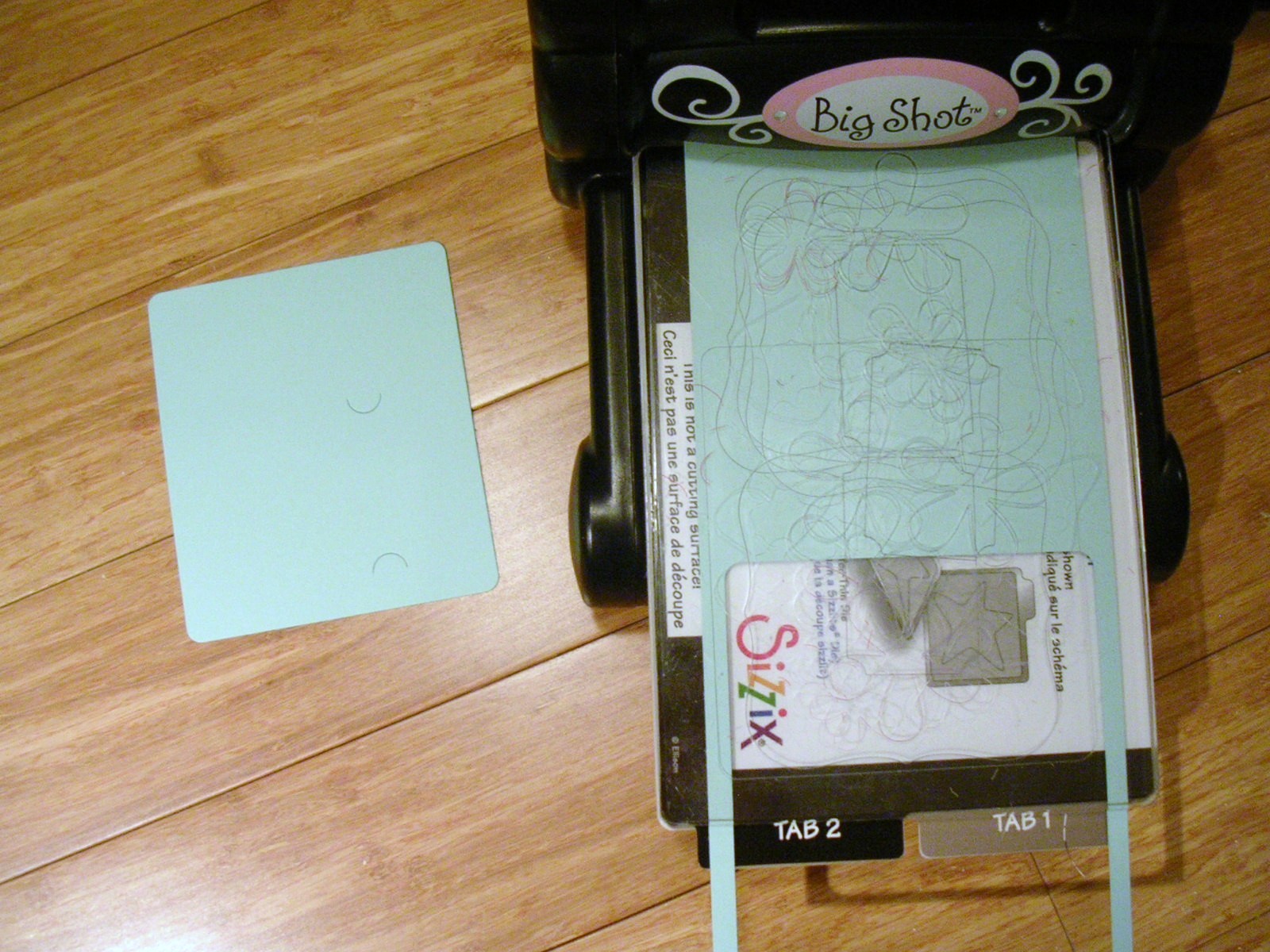
Then I ran the mini calendar die through the Big Shot.  Two die cuts were created from each 5.5 x 11 '' piece.


And then I just played; putting various items together.  I didn't want to take too much time, so the embelishments were minimal. 

For January I rounded the corners of both the PP mat and the calendar.  I adhered the PP onto aqua mist and decided not to run it though the Big Shot again (and therefore not use the tabs created by the die) as this gave me more options of where to mount the actual calendar.  The buttons are hawaiian shores, the ribbon cream satin.


For February I added a small bow with the 1/8'' silk ribbon.  After I did I thought, shoot, I should have made a line with my copics like Nichole does!  This is an ocean tides base.


For March I stamped a leaf from Turning a New Leaf onto enchanted evening with versamark and heat embossed with clear powder, then added some pearls. 


April is my favourite - I matted the PP on cream and dark chocolate, then used a Beautiful Blooms die with kraft paper, stamped text in brown, and added a melon berry button.


May I went out on a limb - PP on kraft cardstock, with a gold heat embossed flourish, lace trim and a scarlet jewel mat made with the label 1 die.  I rounded the corners again on the calendar.


And June using In Bloom ocean mist PP, with aqua mist and spring moss satin ribbons.


I decided since this one is for me, and I like the way these turned out, I will probably just adhere the next 6 months (July - Dec) mini calendars overtop of the (Jan - June) existing ones at the end of June.  Or, if I get bored of them, then I'll make 6 additional pages - that's the beauty of making my own, I get to choose!  And this way I can get a head start on other's Christmas presents.  :)  Now that I have the measurements in front of me for the various layouts, it shouldn't be very time consuming. 

Although some of the pages were a little bulky, all 6 fit into a calendar CD case that I purchased from PTI.


Saturday, October 16, 2010

Birthday Balloons

This card I made for my husband, who like most men I've asked, likes simple flat cards with minimal embellishments.  I understand that ribbon is a no-no.  And don't even start him on buttons! 


 The background is from BB: Retro.  It's my favourite from that set; it's got that ledger-y look. 


I embossed the greeting with clear powder.


I hand cut the circles and added some shading with copics.  The clouds were made by twisting a small sponge dauber in circular motions.  

He said he liked it.  :)


Supplies; Stamps - Everyday Button Bits, Background Basics: Retro and Giga Guidelines (PTI), Ink - Summer Sky (Memento), Not quite Navy (SU), black and cream (PTI),  Paper - Spring Rain, white and Green Boutique PP (PTI), Other - Spring Rain copics, clear embossing powder.

Monday, October 11, 2010

Fizz, Leaf, Melon

Wanted to make a card with some bright colours, but as this does not come easily to me, I focused the colours on the embellishments. 

Between the grass and buttons and wings, lots of dots in this one.  I also stamped polka dots at the top in versamark (to make a sort of cloud), but it's hard to see in the picture.  The wings are coloured in with coordinating markers.


Supplies: Stamps - Everyday Button Bits and Polka Dot Basics 2 (PTI), Paper - white, Ink - Olive (Versamagic) pounced after Lime Pastel (Colorbox chalk), Versamark, Other - buttons (rasp fizz, new leaf, melon berry; PTI) markers (SU), white twine

Wednesday, October 6, 2010

Trying Something Different

I wanted to try some cards outside of my usual style.  My starting point was a sheet of tag die cuts  - botanicals, butterflies and so on.  Sort of vintagey in appearance.   I thought some distress ink sponging would go well together with those images.
Took a deep breath, jumped right in before I had a chance to change my mind. 
Turned out very different for me, but I like it! 


This one has the flourish embossed with red ink. The sponging is quite a bit messier than I'm used to doing, but like I said, I just kept going so I wouldn't second guess myself.


This flourish was stamped with versamark and clear powder embossed.  I used the resist technique with distress inks to make the image appear. 


Supplies; Stamps - Fancy Flourishes, Background Basics: Text Style and Retro (PTI), Paper - cream, Graphic 45 die cuts, Ink - Versamark, Antique Linen, Tea Dye and Fired Brick (Tim Holtz distress), Other - clear embossing powder, dark chocolate ribbon cut in half, twine, foam daubers.